
Work and Wages: Where do workers stand now, financially?
Current and past statistics affirm the depth of the 2009 financial crisis, as it affects workers
Updated: May 19, 2010
by James M. Flammang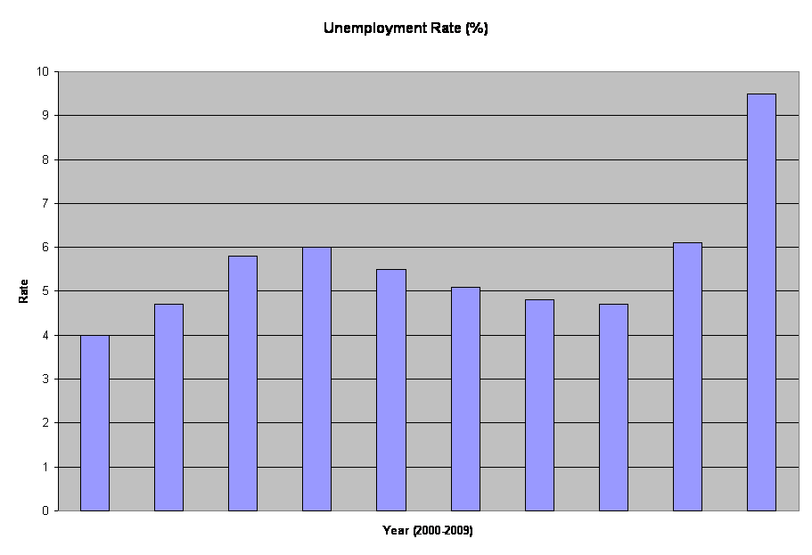
Unemployment Rate, percent (2000 to mid-2009)
(Data from Bureau of Labor Statistics)
(August 2, 2009) Every month, the Department of Labor and other governmental agencies issue a formidable selection of statistics that reveal changes in the economic status of Americans. Several of the figures are especially relevant to workers, who wonder if they're doing better or worse than they were a month, a year, or a decade earlier.
Consumer Price Index (CPI)
Issued by the U.S. Bureau of Labor Statistics, the CPI is far from perfect; but it's the best indicator we have of the shifting cost of living. Study of recent CPI figures demonstrates whether prices are going up rapidly, remaining stable, or (not likely) slipping downward.
CPI charts use the years 1982-84 as a focal point. For that time frame, the CPI is assigned a value of 100. For years when prices were lower than in 1982-84, the CPI figure is lower than 100. When prices are higher than in 1982-84, the CPI figure rises above 100. Because there's been an almost steady progression upward through the years following World War II, CPI figures are lower (two-digit) up to 1982-84, and higher (three-digit) leading up to the present time. Actual dollar amounts are not used; it's strictly an index, intended to demonstrate change over a specified time period.
Way back in 1913, the earliest year for which a specific CPI figure is supplied, that figure was 9.9 (one-tenth the CPI figure for 1982, which is assumed to be 100). By 1920, as the nation recovered from the First World War, the CPI doubled to 20.0. Following growth during the "Roaring '20s," the CPI took a sharp drop in 1929, as the market crashed. That fall continued into 1933, which was the low point of the Great Depression. By 1935, it was up slightly again, to 13.7, falling again in 1938, when a second (less severe) depression occurred.
As the boom period developed following World War II, the cost of living began to rise quite steadily. In 1953, the CPI was 26.7. After a slight drop in 1955, it rose steadily almost every year, to the end of the century and beyond. In 1960, the CPI was 29.8; in 1967, it was up to 33.6. By 1975, inflation sent prices rising, reflected in the 53.8 CPI figure. That was nothing compared to the mid-1980s, when the CPI topped 100 and kept pushing upward, reaching 152.4 in 1995. In 2006, the CPI reached past the 200 mark. June 2009 saw a CPI figure (for all urban consumers) above 214.
Imperfection in the CPI is especially significant when comparing today's situation to earlier periods. That's because the "market basket" of commodities used for evaluation changes over the years. It's supposed to reflect typical consumption for a family, but experts disagree on the actual items that might be considered necessary for an acceptable life. When did TV sets become part of the picture? How did the emergence of fast foods affect the CPI? How much gasoline is needed yearly, for typical family life? The list of possible questions - and arguments - is virtualy endless.
For that reason, we can't accurately say the cost of living in 2006 was twice as high as that of 1982, just because the CPI figure was 100 in 1982 and just above 201 in 2006. But it's safe to assume that living costs roughly doubled during that period.
Unemployment Rate
Statistics on unemployment in the U.S. work force also are maintained by the Bureau of Labor Statistics. The financial crisis that developed during 2008 has brought steadily rising unemployment. By mid-2009, the unemployment exceeded the levels that were anticipated by the Obama Administration when the new President took office in January 2009, reaching 9.5 percent in June.How does that compare to unemployment figures over the past century? Not since 1982 did the rate reach 9.7 percent, and that was the highest figure in the postwar area. In 1948, three years after the end of World War Two, only 3.8 percent of working Americans were unemployed. By 1953, the rate dipped to just 2.9 percent - the low point of the past half-century.
Recession in the late 1950s sent the unemployment rate from 4.3 in 1957 to 6.8 percent in 1958; but the rate dropped to 5.5 a year later and remained moderate through the 1960s. Unemployment rose sharply in the early Reagan years, hitting 9.7 percent in 1982. After easing through the 1980s, the rate reached 7.5 percent in 1992. By 2006, it was down to a modest 4.6 percent. Then came the financial crisis, which sent the unemployment rate soaring toward 1982 levels.
Average Hourly Earnings
Figures for hourly earnings of full-time production workers illustrate the difficulties of making comparisons. These figures are in current dollars, meaning they represent the actual dollars paid to workers in the stated year. Far more useful are amounts that are converted into "constant" dollars, taking into account the shifting value of the dollar from one year to the next. One year is taken as the starting point, and all other earnings figures are given in amounts that would be equivalent.For example, in 1964 the average hourly earning rate was $2.53. Growth was virtually steady over the succeeding 45 years. By 2009, it had risen to $18.53 per hour. That's more than seven times as much, but today's workers definitely aren't earning seven times the wages paid back in 1964.
January 2010 Update: The Department of Labor reports that in December, the unemployment rate was unchanged from the prevous month, at 10 million - the hign point thus far in the "recession." Persons employed only part-time for economic reasons totaled 9.2 percent (a figure that had been flat since March 2009). Another 2.5 million were considered "marginally attached" to the workforce, including 929,000 "discouraged workers" (up from 642,000 a year earlier).
Also in December, the Consumer Price Index rose 0.4 percent over the November figure. Average hourly earnings grew by 3 cents, compared to November, while payroll employment dropped by 85,000 people.
February 2010 Update: In January 2010, the unemployment rate dropped from 10 to 9.7 percent (14.8 million), according to the Department of Labor. Long-term unemployment (more than 27 weeks without work) totaled 6.3 million people. Since December 2007, that latter figure has grown by 5 million. March 2010 update: The official unemployment rate remained steady at 9.7 percent in February. However, "real" unemployment - taking into account people who were working part-time rather than full-time, or were otherwise unemployed, was cited at 16.8 percent. Some analysts believe the actual "real" figure is higher yet. Unemployment continues to vary considerably among racial groups: 8.8 percent for white workers, 12.4 percent for Hispanics, and 15.8 percent for African-Americans.
May 2010 update: In April, the official unemployment rate rose by 0.2 percent, to 9.9 percent, despite the fact that total nonfarm payroll employment grew by 290,000 jobs. The main reason was growth in the labor force by 805,000 workers - largely, people who had given up looking for work but recently resumed that quest as the economy appeared to improve slightly. As of April, there were 15.3 million unemployed persons, by official estimate. The number of long-term unemployed workers (out of work for more than 27 weeks) stood at 6.7 million: 45.9 percent of the total unemployed. The number of workers who were involuntarily employed only part-time was unchanged at 9.2 million.
Expansion Note: Regular updates with recent figures will be added periodically. We will also be adding data on other aspects of worker incomes, including average weekly and annual earnings, household income, and the minimum wage - which was increased to $7.25 per hour on July 24, 2009. Updates also will include additional explanations of earnings data, and comments on underestimating of unemployment data.